16 common quality score trends. Some should give you a raise and others get you fired
By Brad | 0 comments October 10, 2017
Categories
We recently introduced a feature that lets you graph keyword and ad group quality scores, along with their subfactors.
Since then, we’ve been analyzing common quality score patterns and the reasons behind them.
In this article, we’ll explore the good, the bad, and the downright puzzling.
The flatline

The flatline never changes.
In some cases, this is always a 8-10 regardless of what the company does. It’s common to see this with branded ads. The company can constantly test and change ads and see their metrics improve; but the quality score remains the same. When it’s high, that is a good thing.
The issue though is when this is a 1-3. It’s common to see the flatline occur on very low quality scores as well. This is usually an indication that no one is doing anything in the account to try and improve it. Ads aren’t being tested, landing pages aren’t being improved, and that’s a problem.
The crossover
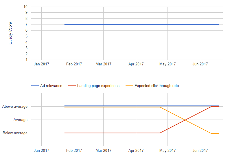
The crossover is one of the most deceiving patterns that exists. It’s what you see if that your actual quality score didn’t change and it’s easy to miss the fact that movement did occur within the quality score sub-factors.
In this instance, the ad and landing page were changed. The new ad performed terribly from a CTR standpoint, but the landing page was much better with the new ad. This client was testing ads and realized their new ad was losing to the old ones. After digging into the quality scores, they realized what had happened.
After tweaking the ad to use some elements of the old ad with the new landing page, the problem was corrected.
The steady improver

This is a great pattern to see. Someone is paying attention to quality scores. They are testing ads, making landing page changes. Over the course of 6 months, they took the quality score of one of their best keywords from 3 to 7.
You only see this pattern when someone is paying attention to their account and regularly testing ads. They’re making data-driven decisions about what to do next.
The death & reboot

We see this pattern the most often in seasonal businesses (or ones that make offers and then forget about it). For instance:
- March: Create a special offer in March that expires in March
- April: Forget this offer is still running. Panic, pause everything
- Later in April: Figure out a new offer and change the ads
- June: Realize their new ads didn’t do as well as they wanted. Used multi-ad group testing analysis to examine how offers do across their account
- July and forward: Tweak the ads, watch the offers, and finally start recovering keyword performance
The takeaway from this pattern is that if you’re having problems rebooting offers, get a good insight on how your various patterns, offer types (prices, discounts, free, etc) do across your account.
The promotional schedule

Some companies never stop running promotions. Each promotion is different, rarely is one re-used, and the landing pages and ads are constantly shifting.
In these cases, you can learn a lot about your company.
- What promotions do best in holiday vs non-holiday seasons?
- What landing page layout and offer combination help quality score (and conversion rates) the most?
- How do short term promotions work against ‘timeless’ ones that can be evergreen in the account?
- How do ad extensions play into your offers and ad experience?
When your quality score is constantly shifting, it can be difficult for your bid management software to keep up. This can cause erratic bidding as one of the bid and position variables is in constant flux.
The steady decline

Outside of a flatline at a low Quality Score, this is one of the worst charts that exist. Every month you just get worse and no one is paying attention. This is why having alerts for Quality Score drops for your top keywords is so important.
These instances often occur when you have a set of ads you’ve not looked at in a long time and your competition is testing ads and improving them. If your competition is doing better from a CTR standpoint, then someone is doing worse. If that’s you, then you can easily get worse over time without making any changes to your account at all.
Walking down the stairs

This is similar to the steady decline in that your quality scores are headed downhill – just not in a steady pattern. The changes occur on very specific dates. This is often self-inflicted, especially after landing page changes. Sometimes you’re forced to change what’s working due to clients having a new offer, tagline or legal issue.
Another common issue with this chart is ‘eyeballing’ data. Humans can find a pattern in anything. When humans stare at numbers, we’re terrible at deciding if the data is random, statically accurate, or if we just need more to determine a pattern. As we’re impatient or need to show something to a client (or boss), we just make a change to the ads.
Making changes without enough data is dangerous, and often your quality scores will suffer as a result.
The expired offer

As I sit and write this in September, a search for ‘black Friday deals’ bring up many ads. One of them even links to a page with a prominent date of November 28, 2013. The page has been outdated for almost 4 years, but the date is still featured on the page.
That’s the danger of promotions that expire. You must pause them. Here’s a common example of what quality scores look like for these offers:
- The deal is on: 10 QS
- The deal expires: The expected CTR tanks
- Someone realizes the mistake and fixed the ad: QS back to 10
In this case, it was a branded term. Moving from a 10 to a 8 on your brand term due to an expired promotion for a day happens. Having it run for 2-3 months is not OK. Be very wary of quality score drops on your top brand terms.
The recovery

This is a good example of someone paying attention. The quality score was steady, then dropped fast. The person realized the drop, made changes, and the quality scores went back up right way. When you are paying attention to your quality score trends, it’s not that hard to recover.
When you’re really monitoring QS closely, you might see the dip even less of a time.

The cliff

Everything looks great, you stop paying attention — and that’s the moment you drive off the cliff.
Once someone realizes the keyword’s fall, then you can start making changes.
The confused

Do you ever feel that quality scores are just random numbers designed to drive you crazy?
There actually was a pattern to this data once you segmented the CTRs by geography to realize the Northeast searched heavily for this term in early spring and the middle of summer and yet this terms was always relevant in the south. However, without digging into that data, this just looks like the quality score is there to confuse you.
Fixing the brand

This brand was doing well and then ran into some issues with their marketing. The team worked hard on ad testing and messages to help the brand get back on its feet. It took a while, but now life is good again.
The truly terrible: should you be fired?

If this is your quality score, you have a problem. The keyword was launched, it did terrible, and no one cared. A flatline at a 1 (this keyword could have 100k+ impressions a month) needs to be fixed – now.
The rise & fall

If we had stopped this chart in May, we would applaud the management. The keyword wasn’t doing well. Someone made changes and turned things around.
But time keeps passing, metrics change, and the quality score drops, had a brief respite, then just stayed down.
At this point in time, the PPC manager should look at what was changed early in the year to make the quality score increase and what made it decrease. They can then use that information for an improvement plan.
Dynamic pages

We see this commonly with dynamic pages and occasionally with flash sales. The ad data (good or bad) stays the same and the landing page goes up and down every month. With dynamic pages, once the page has been read, the page exists. As Google recrawls the page, they see a different version and you get a different landing page experience (with flash sales it’s often about bounceback rates and not different crawls).
The perfect

This is how all your top brand terms should appear.
Find out more about quality score monitoring and automated recommendations. If you want to see graphs like these for your quality scores, start a free trial and see what Adalysis offers.
Share around the web


Related posts
View all
When to pause exact match and rely on broadmatch instead
When to pause exact match and rely on broad match instead
Search term challengesAl Max
Search term challenges Al Max


Leave a comment